
The Color That Can Make You Anxious: What Design Psychology Says About Paint and Mood
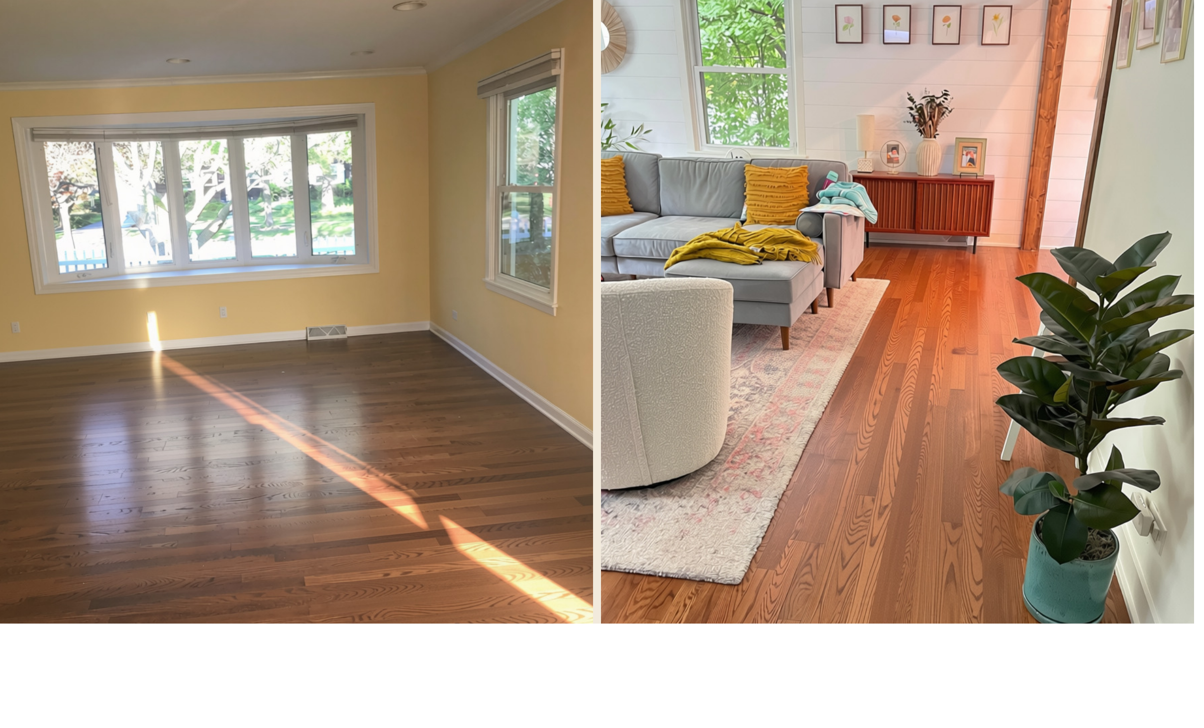
The color that made me anxious. The space that calms me now.
Most people think of color as a matter of taste. Design psychology tells a more complicated story: color is also a matter of nervous system response, and the wrong choice can measurably affect mood, temper, and even physical comfort.
Take yellow. It's one of the most contradictory colors in design psychology's research. In the right context, yellow is linked to optimism, energy, and improved focus. In the wrong one, it can do the opposite entirely.
Carlton Wagner, a psychologist who studied how color affects mood, found that yellow can activate the brain's anxiety response. In an interview with the Chicago Tribune, he described the effect plainly: in infants, it results in crying; in adults, it results in shortness of temper, and noticeably more conflict in a household.
This is where the story gets personal for Psyche Home. Founder Jessica Ryan, Psy.D., experienced this firsthand years before design psychology became her field. The entire first floor of her family's newly purchased home was painted a shade she describes as "Melted Butter" yellow — a color that read as harmless in listing photos, but took on a different character entirely once the afternoon sun hit it. The result wasn't subtle: a consistent, hard-to-explain edge of irritability, every time she walked through the space.
At the time, she didn't have a name for what was happening. It was only later, encountering research like Wagner's, that the experience made sense — and it reframed how she thought about design entirely. If a single, seemingly neutral paint color could measurably shift someone's mood, what else about a space was doing quiet psychological work that most people never notice?
That question became the foundation for Psyche Home's approach to color: rather than treating a palette as a matter of pure aesthetic preference, the platform treats it as a decision with real emotional consequences — one that should be informed by who a person actually is, not just what's currently on trend.
The takeaway for your own space
If a room has ever made you feel unaccountably on edge, restless, or low, the paint color is worth a second look before assuming the feeling is unrelated. A color that reads as cheerful in a paint swatch can behave very differently once it's covering four walls and catching real daylight throughout the day.
This is also why Psyche Home's color recommendations are built from personality data rather than trend forecasts. The same yellow that unsettles one person may genuinely energize another — the goal isn't to declare any color universally good or bad, but to match color choices to the specific person who has to live with them.
Read the fuller, more personal version of this story on Jessica Ryan's Substack, Come Home to You.